So, you’ve seen many posts here (at least 2) ranting about how UI (and subsequently UX) has been impacted in a negative way. I’m combating this through a mixture of tweaks, patches, and if necessary rewrites from the ground up.
3 rewrites that I’ve done so far are:
Files (replaces Finder)
Notes (replaces Apple Notes or Obsidian or whatever)
Tasks (replaces Apple Reminders)
Now I may have gotten a bit carried away with the rewrites. After applying my Ammonia Tweaks, Finder and Notes are MUCH more usable. However, Tasks is still not great even with the tweaks. And another thing is that all of these are CLOSED SOURCE. So little things that bug you like Apple Notes not supporting code block are just something you’re forced to accept. But, by rewriting them with a permissive license, I get what I want, and anyone else can crank something good out with Claude Code.
But software development is both an art AND a science. You want your code to be simple, concise, and efficient, but you ALSO want it to function in a way that feels “natural” and at the same time looks good. Just to fire a shot, Joplin is a great open source note taking software, but it looks bad (IMHO).
With those in mind, I set off to design some programs. And… it was much harder than I thought. I’ve gone through SO many iterations. Thinking of all the different ways to present data, navigate, what actions to take? Many times, I thought that I was done, just for updates over the next week to take me to a completely different and much better place.
To this end, I’ve ended up on a rather simple design that is effective and common across the 3 apps that I’ve listed above.
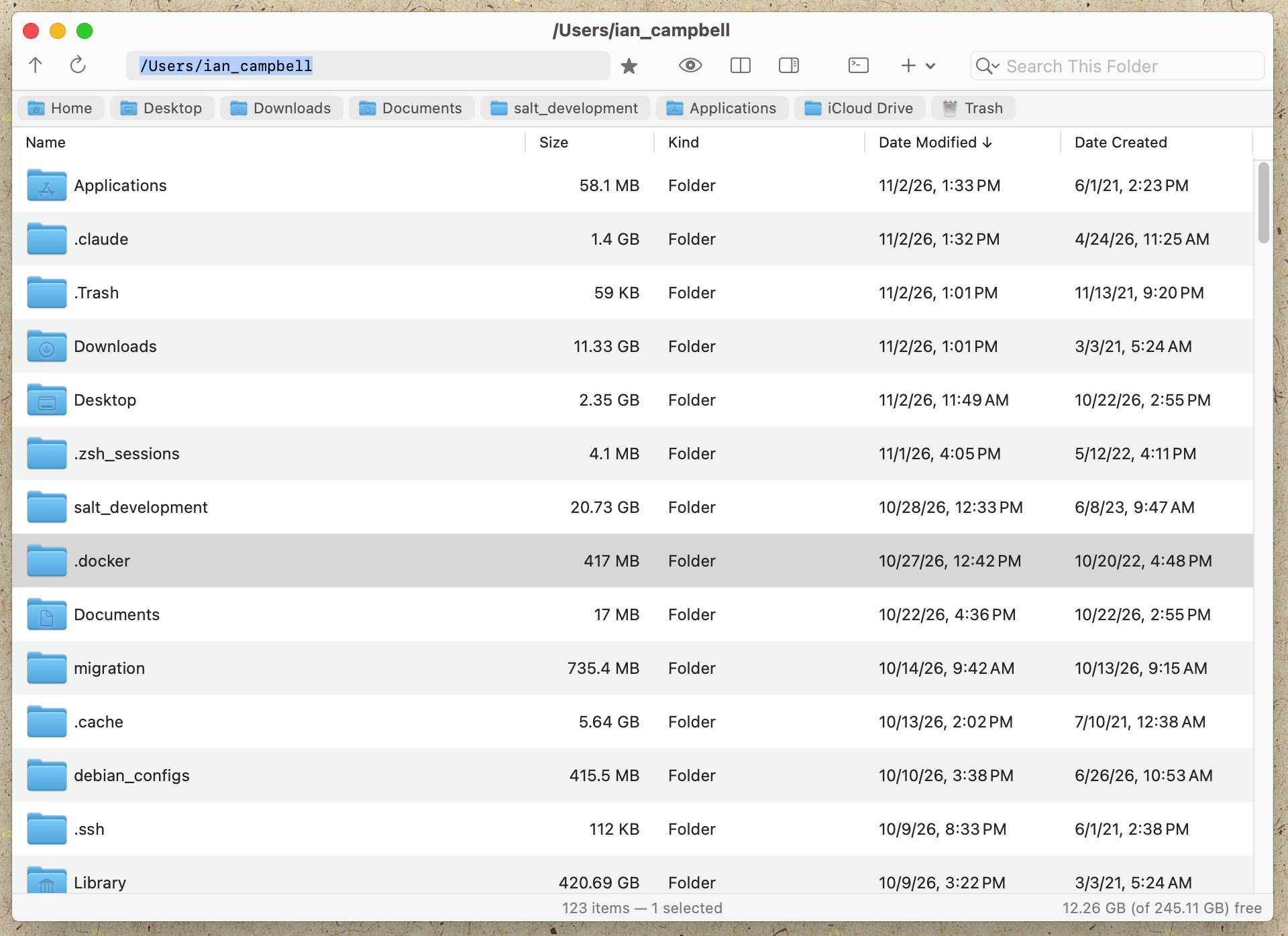
Here’s a screenshot from my Files app. It’s got your standard buttons, text fields, and tables. It should be instantly familiar to anyone who’s used MacOS Finder or Window File Explorer (or Thunar…)
The areas of the window are broken down like this:
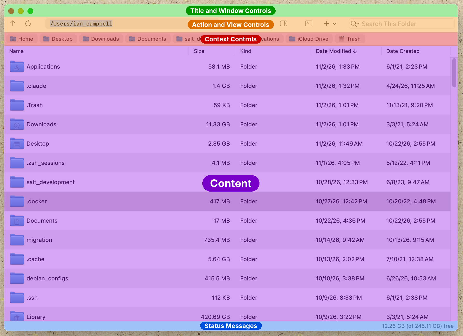
Title and Window Controls ALWAYS at the top. This is uniform across ALL windows as it should be for muscle memory and consistency. (You learn the OS and not each app)
Next, you’ve got all of your Action and View controls. These are quick ways to perform common actions with the program. Or to change the presented content in a meaningful way. Other, less common, commands are in the menus.
Third are Context Controls. This allows you to narrow or broaden the scope of your presented content. Think folders, tags, etc… Usually, this is presented in a sidebar these days, but I don’t like that 2 different things are presented on the same row that way. I do still have a sidebar for my apps because sometimes you can’t handle all of your context in a small row, but its collapsible and hidden by default. 90% of the time, you’ll use the row shown here.
Next up, of course, the Content that you’re trying to view. Tables are my go-to since they are ubiquitous and easy to use. But any content can be shown here (images, object fields, etc..)
Finally at the bottom, the classic Status bar. Its out of the way, but its a constant line of communication between the app and user to tell you what is happening. And even a blank status line still tells you something.
This design has been reached through natural evolution, and for me, it works really well. I’ve reached it through many many iterations, and it has grown from some ugly designs to what you see today. It is still a bit immature (hence the title of this post), but changes have definitely slowed down from the radical changes I was making early on in development.
And if you learn it with one of my apps, you’ll know it for the rest. OR if you don’t like it, all my apps are open source. Fork one and make your own!